 UPCOMING WEBINAR: From Thousands of Tables To One Clear Story: using AI in survey analysis
 When analyzing numeric data (i.e. Age in years or Income in $), you may want to review the spread of the data and create categories from this to analyze vs the raw numeric values. Displayr makes it very easy to do this with its categorizable histogram feature. With this, you can visually see and set the boundaries of your categories and save the categories as a new variable to use in your analyses. There are also other methods of banding (or categorizing) numeric data depending on your needs. This article describes how to use a numeric variable to create a histogram that can be used to divide responses into groups (buckets) for analysis.
The benefits of categorizing are:
- Allows you to create categories from the more granular, numeric data you collect, rather than guessing at banded categories upfront in your survey question.
- Dynamically creates and adjusts categories/buckets that suit the distribution of your responses (i.e., if you get a lot of young people answering your survey, you can specify lots of young age categories).
- View percentages instead of an average.
- Break down other questions in your survey by the newly created categories.
Requirements
- A Displary document with a data set
- At least one numeric variable. Displayr will normally infer that a variable of numbers is Numeric, however, if the data is Text, you will first need to convert it to Numeric via the Properties
> Data > Attributes > Structure > Numeric.
The data set called bus phone survey.sav has been used in this example.
Method
- Drag Years of operation of business (numeric) from Data Sources tree onto a Page or the Report tree, and you will get a table that looks similar to below.
- With the table selected, click on Visualization > Distributions > Categorizable Histograms from Properties
- Go to the Histogram Categories section in the Data tab of Properties
- Observe that the options are:
- Do not generate – selected by default.
- With equal proportions – this is a starting point, where the data is categorized into 3 categories with equal proportions (e.g., 33%, or as close as it can be, according to the data).
- With equal intervals – this is an alternative starting point, where the 3 categories are equally spaced between the minimum and maximum.
- Observe that the options are:
- Choose With equal proportions.
- A new field for Number of categories appears and defaults to 3. Two red cut-off lines will appear on top of the histogram.
- A new Nominal (categorical) variable labeled Histogram categories - your variable has been created in the Data Set that buckets responses into each banded category. The labels of the data match the labels shown above the histogram (“Less than 11,” “11 – 24” and “25 or more” in this example). The values for those categories are in sequential order (1, 2, 3 in this example).
- OPTIONAL: You may customize the categories and values. For example:
- Change the Number of categories - You can change the number to 4, for example, to add a new red line on top of the histogram and category to your variable.
- Change the category cutoff points - For example, click on the first red line so it appears selected. Once it appears selected (a new grey rectangle appears around it), click and drag the line to the left or right to change its cutoff point. Once you let go of your mouse, you can observe that the category labels and percentages update automatically. (Tip: when the red lines overlap with the blue bins, they can be difficult to select. You can change the category cutoff point in Properties
- Change the category values - When you convert your numeric data to categories, there can be only one Value per category, and thus, the more granular underlying numeric values are not available using this transformation. If you are interested in seeing an average for each category, you can change the value for each category to a midpoint, see How to Recode a Variable Using Category Midpoints, or if you need an exact average, you may need to band a variable using a table instead, see How to Band Numeric Variables Using a Table.
- You may now use the new categorized data in other charts or tables:
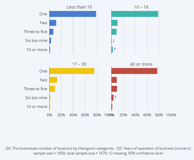
- Drag Q4. The businesses number of locations (a nominal variable) from under Data Sources tree onto the page.
- Change it to a visualization using Visualization > Bar > Small Multiples Bar from Properties
- In Data > Data Source > Columns, select the new data Histogram categories - Q5. Years of operation of business (numeric). (Tip: This new variable will be next to the original Q5 variable.)
- Observe that the chart now shows the data by your categories.
- OPTIONAL: You can change the labels by selecting the variable Histogram categories - Q5. Years of operation of business (numeric) in the Data Sources tree, and then clicking the Values & Labels, Values, or Categories button in the Data > Attributes section of Properties